Responsive Design vs Mobile
by Blue Guys
As mobile grows more and more popular, websites must adapt to change—but should you choose a mobile website or responsive design?
Mobile optimization is becoming more and more trendy these days and it is no surprise. So if you don’t want to lose your piece of the pie, it’s time to step into mobile world.
Responsive Design vs Mobile
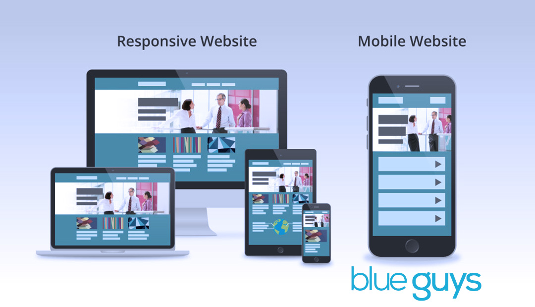
Both a mobile site and responsive design will optimize your site to be more appropriate for smaller screens; both will offer simpler navigation and faster load times. However, there are differences, which is why we share the advantages and disadvantages of both solutions below.
Responsive Design
Responsive web design allows you to have a single website that automatically fits the screen size of the device on which it is being viewed.
Rendering Experience In responsive design, the device does the work and automatically adjusts according to a device’s screen size (large or small) and orientation (landscape or portrait). It switches between these options on-the-fly.
A very good and flexible solution.
Domain Protection Responsive design lets you keep your own domain—nothing changes except code on the back-end.
Googles thinks this is the better solution …Maintaining a single shared site preserves a canonical URL, avoiding any complicated redirects, and simplifies the sharing of web addresses…
Link Equity Since responsive design simply embeds new code on the back-end of your website, your company’s link equity is preserved.
Better option for search.
Future-Ready The technology is more forward-thinking because once added to site it will work on next months and next year’s devices without having to be programmed further. A better return on your investment.
Mobile Site
A mobile website is designed specifically for mobile devices considering all the limitations and opportunities of the platform. While developing a mobile website you should keep in mind the small screen size, interaction methods (touch) and limited connection speed (2G/3G). Content must be easily accessible, fast-loading and readable.
Rendering Experience A mobile site is essentially a copy of your website, where the server does the work to deliver an optimized page that’s smaller and easier to navigate. The solution can really customize a unique experience for mobile users.
A good choice when it might be too expensive to redesign responsively.
Domain Protection With a mobile site, you must create a different domain (many companies choose to differentiate theirs by “m.domain.com”).
Can dilute domain and hurt organic search traffic. Can add to website management because you have to maintain two separate silos of content.
Link Equity Because a mobile site uses a separate domain, links shared from mobile browsers will not count as search link equity toward your primary site.
Not as good for search.
Future-Ready Re-working of a mobile site might be needed in order to stay current with next-generation phones and mobile browsers.
Could require higher maintenance and expense.
Recommended Posts

Social Media Influences Web Design
February 17, 2017

Professional Web Designer
July 21, 2016

Websites Tell Stories
July 21, 2016